
McDonalds at Budapest’s West railway station before and after recent renovation


wtf did they do!?
It’s supposed to make you hungry.
I’m angry at what was lost. Bring back the plants, the hanging lights, and just the normal tables that provided a single modicum of privacy in a train station.
We’re not cattle that need to be herded into a corner FFS
I’m ok with McDonald’s actively making their shops (I refuse to call them restaurants) less appealing. It’s not like eating their shitty, and now overpriced food is ever a good idea anyway.
It depends what McDonalds is to the area. For me it’s the one place open at 2am on a Friday night, where people from all walks of life (posh wedding party coming back from a long drive, pissed students, overworked deliveroo drivers taking a break) can sit down almost next to each other in the same area and order the same thing.
McDonalds has always been this great equalizing public square for me, rich or poor, black or white, local or migrant.
That first photo kind of encapsulates that feeling of it being a public space where people can eat and discuss topics at their leisure. The second one feels like that sense of restful decorum is lost.
I got food poisoning from them last week. Like i shit and puked myself from their chicken sandwich.
The plants looked too much like healthy vegetables.
for change
…a hospital waiting room?
Maybe a hot take but i like that they removed the mini stairs. Looks like a tripping hazard when carrying your tray of food :/
That’s an American mind thinking, in Europe if you trip you stand back up and continue with your life
Yeah but ur food is gonna be on the floor.
I miss the time where everything had a distinct identity. Shapes, colors, a bit of imagination…
The motto now seems to be sterile, monochrome, uniform design; nothing must stand out. Subway station? Moved from colorful place with art stuff on the walls to white, squarey area. Fast-food? two-colors, no decoration (except for advertisement collaboration of course). Store? Bland aisles full of items, no billboard, no nothing.
All logo are converging toward a single letter/shape with no feature. All UI must be full of empty space and devoid of lines/distinctive features, with components similar across everything. Gadgets and gizmo? Smooth, uniform, nothing extravagant.
No wonder every time anything with a bit of personality comes out it’s acclaimed to no end.
Yes. Can’t offend any race or creed or culture or dog or bird or alien or language or…
ALL GRAY!
This is all to make resale easier. Future adults will never be able to look at a building and say, “Hey, that bridal boutique used to be a Pizza Hut!”
Everything is so fiscally optimized, it’s kind of gross, absolutely no character to just designing things to be part of an experience.
They do this because it offers corporate more flexibility when it comes to selling a place.
horseshoe theory

I understand that they stopped marketing fast food as fun and towards kids for a reason but damn do I miss 90s McDonald’s
Look at what they took from us.
Nothing like dragging your junk across those eyes over and over while eating your nuggets.
Barter and trade. I want your nuggets, here’s my nuggets.
A yes, the Reagan era.
Late to the party but I’ll chip in my anecdotal evidence of the local Hungry Jacks that looked like this up until circa 2021:


It was then fully renovated and my immediate reaction was just, what have they done… I don’t have a picture of that particular HJs post reno but they all literally look the same seldom floorplan, so here’s one with identical design language.

The old one almost felt like an American diner with the red glistening seats, the ceiling neons, the diamond tiled floors.
deleted by creator
We had clearly defined enemies back then and they weren’t us.
No! You guys were always imperialist pigs
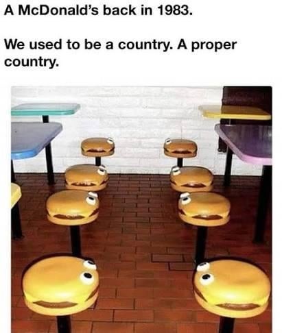
The 80s & 90s had some wild style.
Wait, 1983?
Where are the ashtrays?
Username checks out.
Ig McDonald’s went with minimalism approach.


