
gtk3, gtk4 (probably?) qt, qt in flatpak, gtk3 in flatpak, gtk4 in flatpak (probably)… I’m just not fighting it anymore
doesn’t help half of electron apps decide to theme themselves. It’s a massive pain on Windows too.
Meanwhile kde:

i found the original in reddit, from about four years ago
https://www.reddit.com/r/kde/comments/tffr4l/some_kde_plasma_uiux_problems/#lightbox

(i’m not saying it’s related, but at least people should be able to read the text now)
GNOME: Designers trying to Develop a desktop. KDE: Developers trying to Design a desktop.
Some points are valid, but this looks more like the author (of the image) wanted to highlight as much as possible to confirm their own bias (that it’s not well designed). Maybe I’m being ragebaited, but here we go:
Different font size and styles for main panel header
Yeah, one shows breadcrumbs and the other a title.
First icon is narrower than the rest
First one is the “start menu” button. The tasks could also have text labels on them, of course they can have a different width to an unrelated element.
Content not even remotely close to being vertically centred in its box.
It can show two lines of text (as evidenced by the third item in the same row). It would look pretty bad if every item was centered on their own.
This is absolutely pixel perfect alignment. More like this please!
It looks good, but the red line the author connected from the snowflake to the horizontal line of the “H” doesn’t necessarily back their claim that this is “absolutely pixel perfect alignment” because the horizontal line of the “H” might not be geometrically centered to the line height of the text and you could also have different characters in different languages.
Yeah, some elements like the scrollbars aren’t positioned well (in this screenshot, this is a bit outdated tbh). But there’s also the concept of a visual center as opposed to the geometric center.
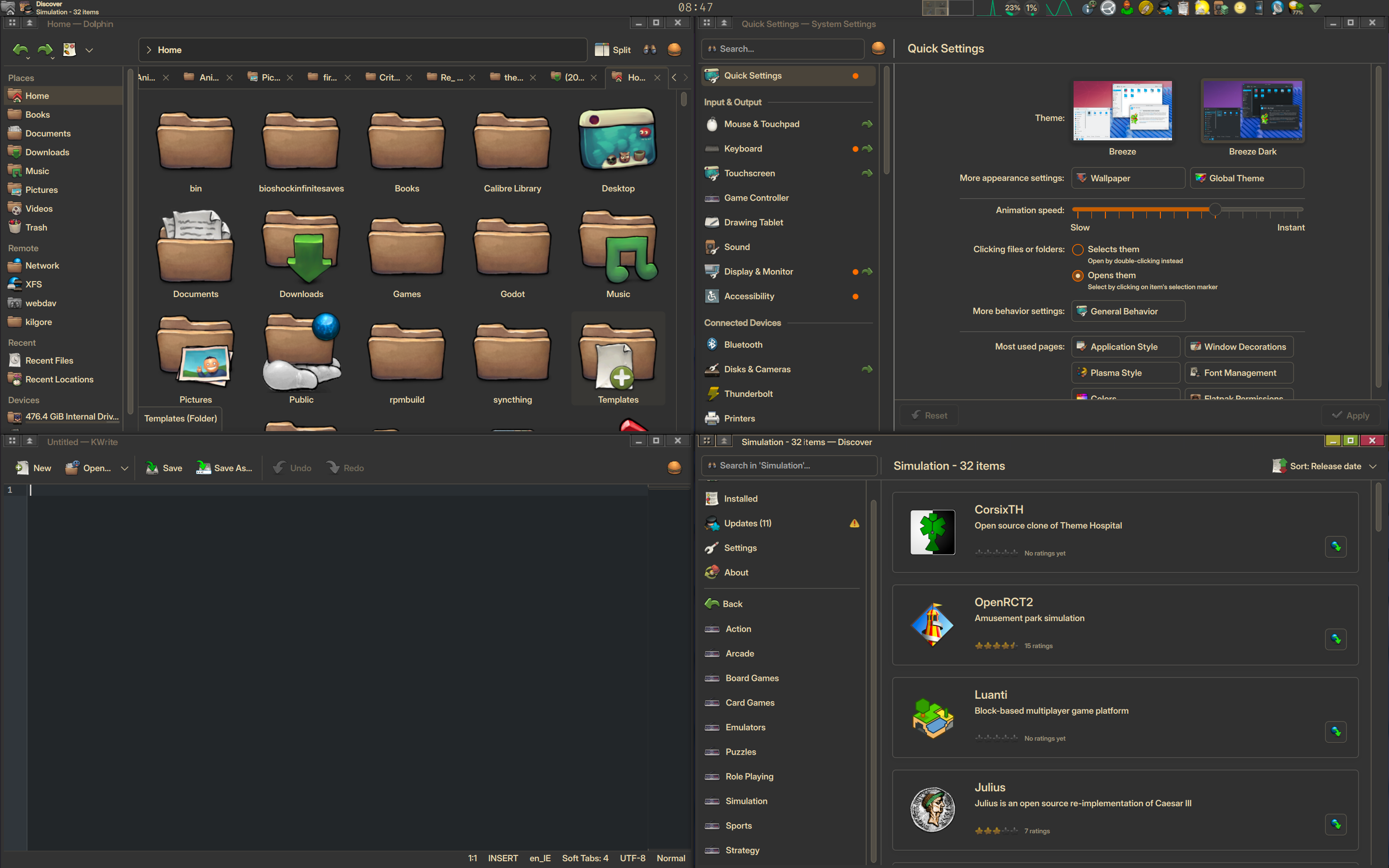
Looks much better to me nowadays, although yes, I am not using the default Breeze theme. But if there are any problems in the theme I am using, they are much more likely to not be present in Breeze.
Some “issues” pointed out in the picture are not issues at all.
The “Different font styles and sizes” for example, because they are used for different things with different scopes and user interaction.I am very glad that you have found what makes you happy, keep using what you like- those icons hurt my soul
Unfortunately, the issue is more widespread in the world of UI design. Even in closed ecosystems like Windows, you have a random mix of different UI styles, and this cancer called “flat design” makes things even worse. Carl Svensson published a nice blog post about exactly this issue a couple of years ago: https://datagubbe.se/decusab/
At this point I’m just happy if they’re all using a dark theme at least.
True
Heh, everyone here seems to be coming from kde or gnome, and I’m over here with xfce like that guy with the bong while the two girls fight.
Meanwhile MATE chads just sitting in the attic listening to the chaos.
MATE is the first of four “Screw that we’re forking GNOME” distros.
They all look great man, congrats
Perfection is a mindset to make you unhappy. Let it go.
Happiness is a distraction from perfection, let it go!
Pissing is a scam to make you drink more, let it go
This is the kind of shit that stops people from migrating to Linux.
Lack of consistency in the UI. We’re in 2025 dammit. Not 1995.
Edit: okay, WTF Windows is now even worse?!?
It’s sad that this gets downvoted to hell. As a MacOS user who appreciates beautiful UI, this is a major pain point for me on Linux. And yes, Windows is the absolute worst at this.
Same.
deleted by creator
As someone using a tiling wm idk what these buttons are for.
in fact, i removed the top bar from all apps… and i’m on kde btw


